Fund SDK September 2026 Enhancements
Summary
This release continues our work to make the Fund SDK faster, simpler, and more trustworthy. It focuses on moments where users often hesitate: choosing a network, moving an address between apps, and picking the exchange or wallet to fund from. Every change is aimed at one outcome for platforms: empower more users to complete a deposit.
Enhancement 1: Network speed and cost guidance
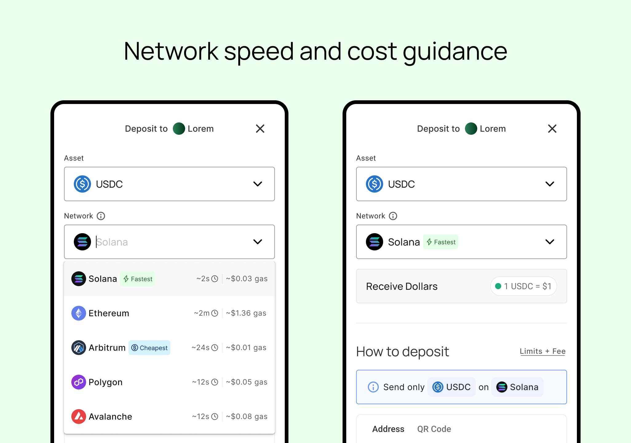
When we watched users face a list of networks in user testing, many stalled, and those who moved forward almost always chose the cheapest or fastest network they had funds on. Too much choice was creating friction.
To empower users to make a quick, informed decision, every network now shows an approximate speed and gas cost along with Cheapest, Fastest, and Top Pick badges that make the best choice obvious at a glance. The screen now provides an automatic comparison so the user doesn't have to.
For platforms, that means less hesitation and drop-off at the network selection step, and fewer users caught off guard by fees or settlement time after they've already committed to a transaction.
Enhancement 2: Clearer deposit instructions and easier sharing
Many failure cases are predictable: the asset is wrong, the network is wrong, the amount falls below the minimum, or the memo is missing.
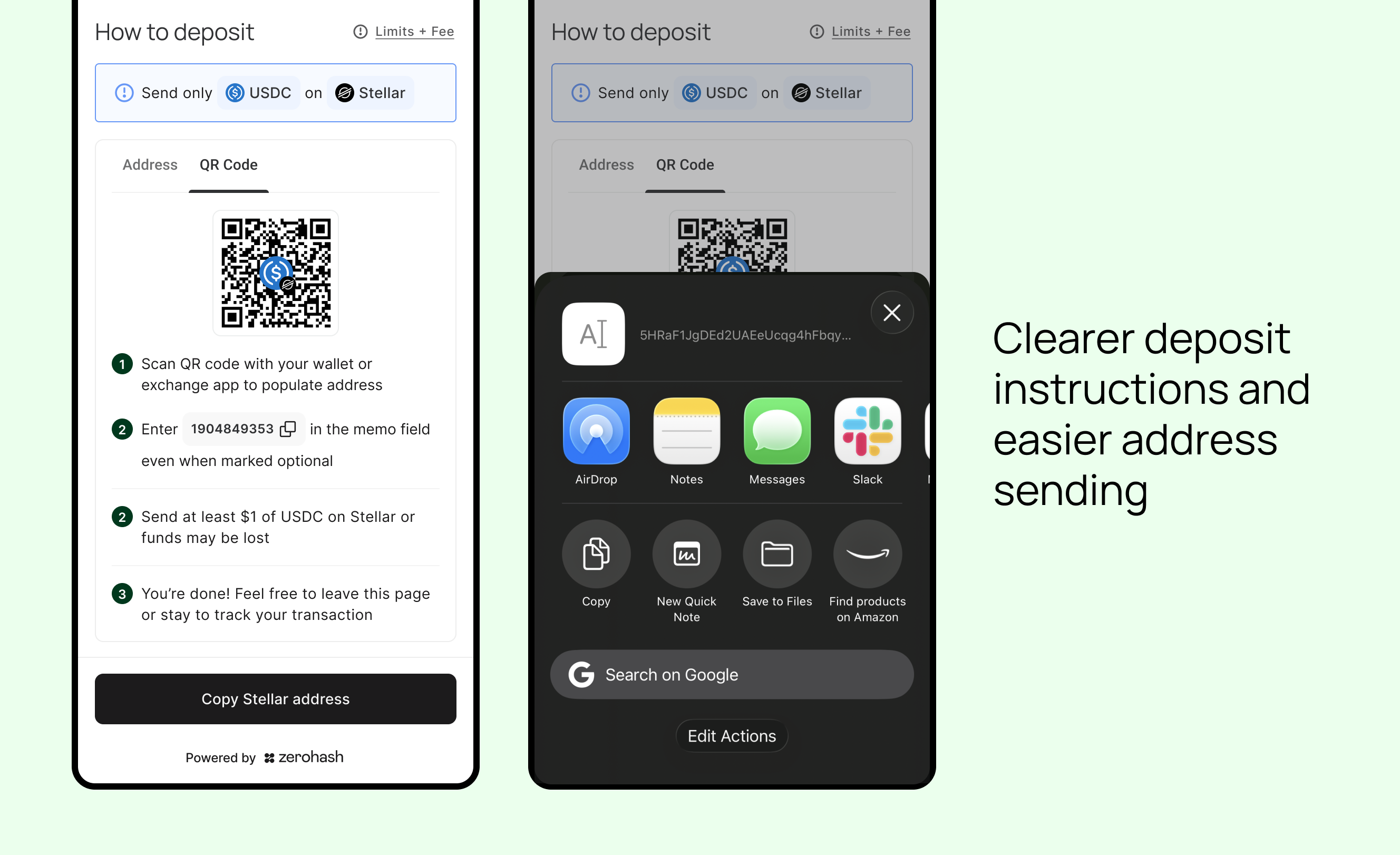
The Fund SDK instructions now anticipate each of these failures. Minimum amounts appear upfront, networks that need a memo guide users through it, and the screen reinforces that only the selected asset should be sent on the selected network.
We also made it easier for users to send their address to the right destination through the native iOS and Android share sheet. Copy to clipboard remains wherever sharing isn't supported.
The result is fewer recovery requests, fewer moments that erode trust, and a shorter path from intent to deposit.
Enhancement 3: A refreshed AUTH account linking screen
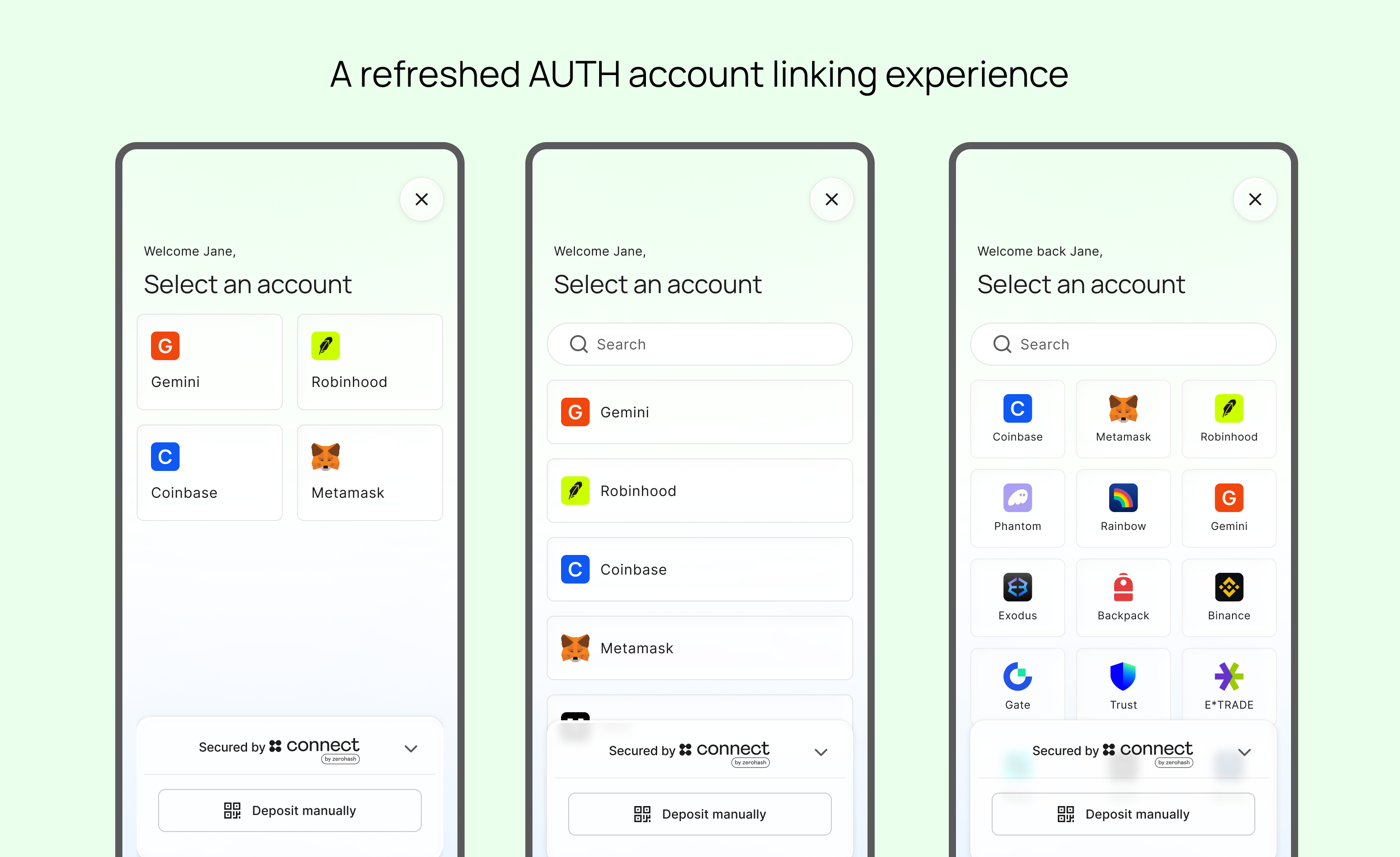
"Connect an account" is the first AUTH screen users see in the funding flow, so it sets the tone for everything after it. We've given it a new light-mode look inspired by Apple's liquid glass, with translucent cards, a glass footer, and a personalized welcome.
Provider tiles now size themselves based on how many exchanges and wallets a platform offers, and they're tuned for mobile and scalable from three providers to hundreds. Initially, the redesign will apply to light mode only, with dark mode as a fast-follow.
This new experience is a more polished, trustworthy first impression at the exact point where users decide whether to connect.